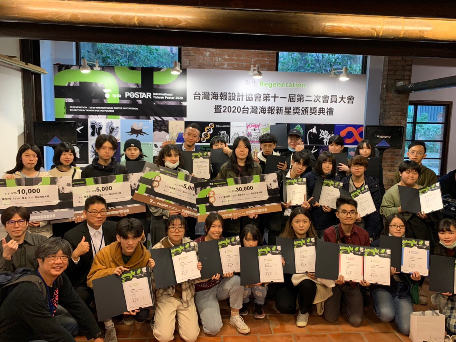
2020台灣國際海報新星獎
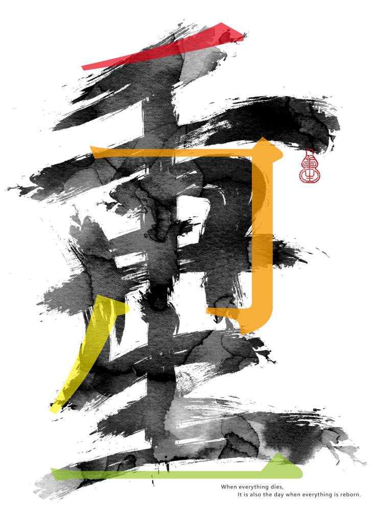
設計理念|「重」
「重」字之中,蘊含著「再」的意涵,本次設計以此為起點,將「重」與「再生」的概念視覺化,探索文字的再構與生命的延續。
筆畫設計融合兩種語言系統:傳統書法與現代明體。一者書寫歷史的厚度,一者描繪當代的節奏。
筆畫設計融合兩種語言系統:傳統書法與現代明體。一者書寫歷史的厚度,一者描繪當代的節奏。
墨韻層層暈染,如同生命湧動不息,象徵自然與時間的有機流動;
而明體筆畫則以飽和色彩切入,將重生的概念轉化為具象的視覺能量,為書法注入當代語彙。
而明體筆畫則以飽和色彩切入,將重生的概念轉化為具象的視覺能量,為書法注入當代語彙。
Design Concept | “重chóng”
The Chinese character 「重」(chóng) inherently contains the character 「再」(zài), which means “again” or “renew.” This poster explores the concept of rebirth by deconstructing and reimagining the character through typographic expression.
The visual form merges two contrasting type styles: traditional Chinese calligraphy and modern Ming typeface. Calligraphic strokes, rendered in ink wash textures, evoke the continuous flow of life—organic, layered, and unceasing.
In contrast, the Ming type strokes are reinterpreted in vivid, saturated colors, injecting the work with vitality
In contrast, the Ming type strokes are reinterpreted in vivid, saturated colors, injecting the work with vitality
入圍
2020
★台灣國際海報新星獎-再生Regenration★
海報設計:廖展頡
指導老師:鄭中義